This isn’t going to be your typical high-level, strategic branding breakdown—because for me, branding is about connection, creativity, and personality just as much as strategy.
I believe in designing brands that we truly love—brands that resonate with us on a personal level. Of course, branding needs to speak to your audience and tell your business’s story, but as service providers and solo business owners, our branding should also reflect who we are. The more we show up as ourselves, the more we attract the right clients and customers.
So… What’s the story behind Groves Creative?
When I first started exploring ideas for my rebrand, I’ll be honest—I felt nervous.
One thing my clients and small biz pals always told me was how much they loved the recognisability of my branding for Gab Design. That instant connection and familiarity was something I didn’t want to lose. I wanted my new brand to feel fresh, but still me.
I went through so many design iterations. I STRUGGLED. But then my amazing friend Corrine saw some of the concepts I had created for other potential names and pointed at one and said:
💡 "That one. That’s YOU."
The funny thing? It was a design I had personally connected with but had set aside because the name didn’t feel quite right. It’s amazing how someone else can see what you can’t and bring you instant clarity.
That same day, I went home, put the Groves Creative name into that concept, and it just flowed. Suddenly, I had illustrations, icons, and ideas for my website popping into my head non-stop. It felt right.
What makes this branding feel like me?
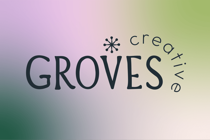
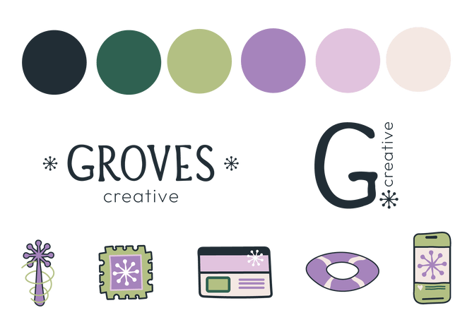
🔹 The Gradient – Bold yet Soft
I couldn’t let go of gradients—they were such a strong visual element of Gab Design, and people recognised them instantly. My new gradient blends depth with softness, showing both the boldness and fluidity of creativity.
🔹 A Strong Decorative Font
This was another nod to my design roots. I love fonts that have character and personality—they set the tone of a brand instantly.
🔹 A Touch of Magic ✨
At the heart of my brand is transformation—I love taking scattered, inconsistent branding and making it feel cohesive and powerful. The spark icon I designed represents that magic—that moment where everything clicks into place. It also reminds me of a flower—a symbol of growth and evolution.
Branding Should Tell a Story
I share this because I want you to know—your branding should feel like YOU.
If you’re going through a rebrand or thinking about refining your visuals, don’t just think about your audience—think about what feels right for you. Because when your branding reflects your passion, your energy, and your uniqueness, you’ll naturally attract the right people.
If your brand doesn’t quite feel like you, let’s change that. Take a look at my branding packages!